
Selling the value of User Research is sometimes an insurmountable challenge. Far too often, we find ourselves persuading stakeholders and selling the value of our work more than actually carrying out our real responsibilities — being the voice of the user, advocating for them and ensuring that the product or service effectively solve.
How might we help Design teams make User Research insights and recommendations accessible, usable and memorable?
Team Members
No team members but several iterations were made based on feedback from
Research teams of clients as well as the Fresh Design Team.
My Roles
User Research
Duration
Jan 2019 - Jan 2020 | 1+ Year
Building on top of the Atomic Research principles, our focus was on storytelling. We still needed to make research intuitive, compelling and consumable.
1
Atomic
The system contains indivisible nuggets of insights tagged with personas, observation instance and other metadata.
2
Visible
All observations, insights and recommendations can be read (or heard).
3
Accessible
Research insights must to be cognitively accessible to everyone.
4
Truthful
The system must be the voice of the user without skewing it.
5
Connected
All research artifacts must remain connected with one another and preserve the integrity of the Research System.
6
Iterative
The system must be a living body that evolves with the product and/or insights.
One of the difficulties with research is there’s so much data to wade through. Our goal was surfacing the most evocative accounts of user pain points and desires. Airtable’s Kanban View was an effective way to do this.
Observations from user testing were compiled, coded and grouped them
Each insight was tagged to a business goal, design element, persona and a priority.
Codes
made it easy to browse and find related information.
Transcripts from interviews were added into individual rows in Airtable
for searchability.
Airtable provided a way to preview audio snippets although it would have been
nice to have been able to preview videos as well, especially for usability tests.
As a workaround,
videos were hosted and the corresponding links were added to the database.
Stakeholders needed a way to see a summary of the research findings
before diving into details. They also liked the idea of a printable document.
Airtable’s
Presentation Block was used to design a template that was auto-populated with the data from different tabs
into a summarized view.
Visualizations were used to tell powerful stories. It would have been nice to have been able to add the visualizations into the Presentation block.
Search block in Airtable provided a way to search through all the data
in the database, including transcripts and insights.
The scope of the search was customizable and
limited to the key tabs to improve the quality of results.
Transcripts enabled searching through
actual words or sentences participants spoke during interviews.
Filtering was key in analyzing specific segments of users and generating
reports. This was a great way to preserve historical insights but viewing the information in a way that
surfaced only the insights that required our attention.
If a previous version of a product had
usability issues that were already addressed, the filters non-destructively removed insights that were no
longer relevant.
Matrices provided a way to visualize insights against business goals,
something that Product Managers were interested in.
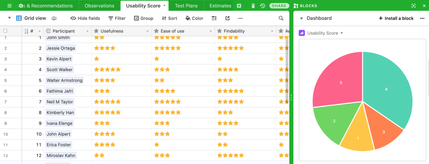
Depending on the project, SUS, SUPR-Q or other metrics were
measured.
The following became the basic building blocks of our User Research System. Depending on the complexity of our projects, we adopted different levels of organization and maintenance to be realistic with our budget and timelines.
1
Research Participants
List of all participants participating in Research sessions.
2
Research Plan
Details of interview, survey, usability test or other sessions conducted.
3
Personas
Just right personas that aligned with business goals.
4
Codes
Labels to tag, organize, analyze and find thematic information.
5
Insights
A theme or interpretation of a set of observations.
6
Observations
Actual occurrence of an event that was noted.
7
Recommendations
Design inferences or recommendations derived from observations and insights.usiness goals.
8
Visualizations
Visual representations of qualitative and quantitative data.
9
Stories
A narration of observations, insights and recommendations.
10
Usability Scores
Quantitative measure of how well the product or system was performing.
11
Metadata
Information describing all other relevant artifacts.
12
Human Interpretation
Probably the most important of all, knowing how to make sense of it all.
“Research-informed design is part art and part science, but also part storytelling.”


